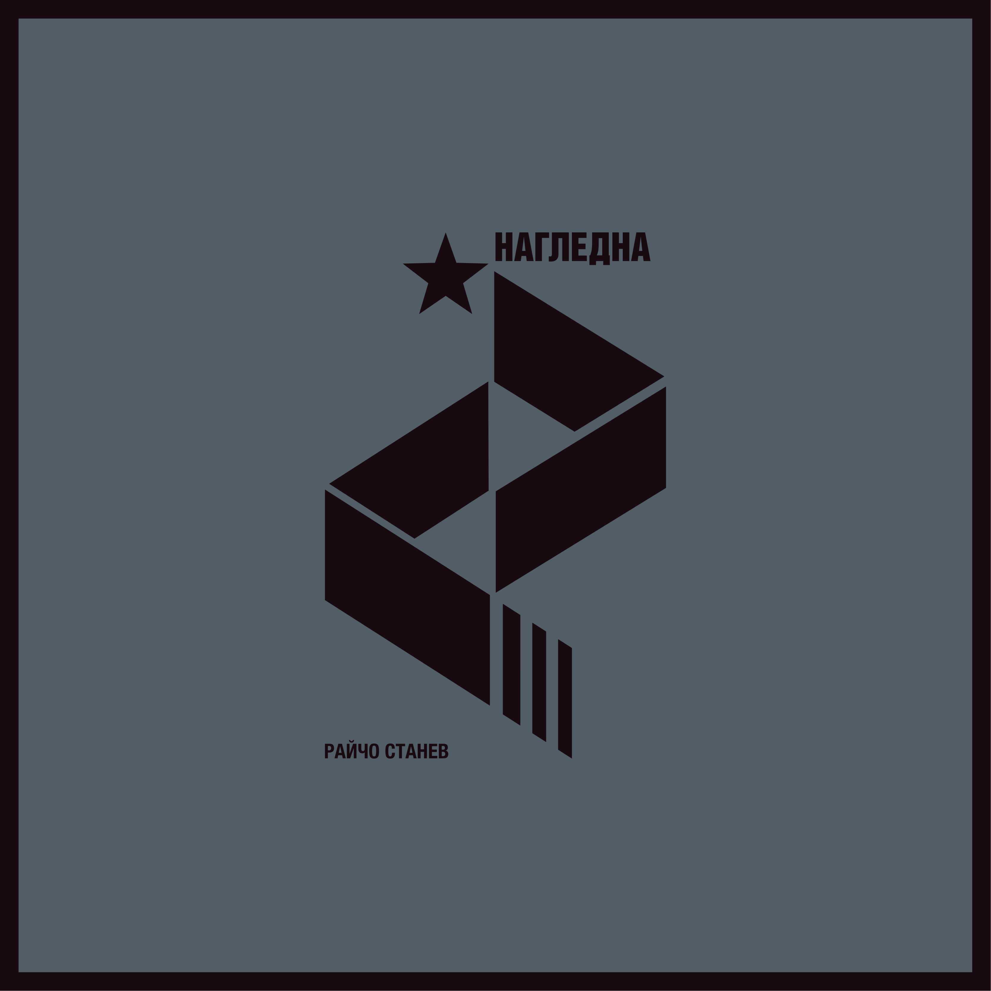
In Nagledna, I explore the place of letters from my father’s newspaper archive. I arrange them so that when a person presses a particular key on the computer keyboard, the corresponding character appears in a different place on the screen as a short animation – the letter grows larger, rotates, and gradually disappears. The rotation is accompanied by a brief sound, which is not the sound of the letter itself, but rather a light ringing tone, with each letter having its own pitch.
In this way, the typeface and the entire alphabet begin to sound in their own rhythm, depending on what the user types. The result is a pleasant, sonorous and colorful composition made entirely of letters.
For me, a truly good letter should be an instrument capable of sounding on its own – not simply following the sound of language, but generating a sound of its own. In this way, a message built from such letters begins to sound in its own way and can be perceived more fully than standard visual solutions that rely solely on beautiful typefaces.


Design in its purest form is a bit conservative, it is composed of a few simple elements that remain unchanged, and when we tie these elements to the memory of time, it becomes art. I will try to define this term more seriously through my practical experience gained during years of working in depth in this field. When doing individual projects in the field of art, I always start from the context of the concept that I have previously thought out. Like a grid in design, the concept tightens my work so that it does not become too vague and incomprehensible. At the same time, once I have covered the requirements of this concept, I feel absolutely free in terms of creativity. But what does concept mean? In my works, I often use my family memories to talk about topics related to major events. In this way, these issues acquire a human image, and in this way, general sayings are not spoken, but an example is given with specific memories. The direction is always from the personal to the public. This is a very important approach, because it serves as a construction that I can rely on whenever I feel some uncertainty. In this way, the topics gradually form in a natural way, and the connection between them becomes stable and sustainable.
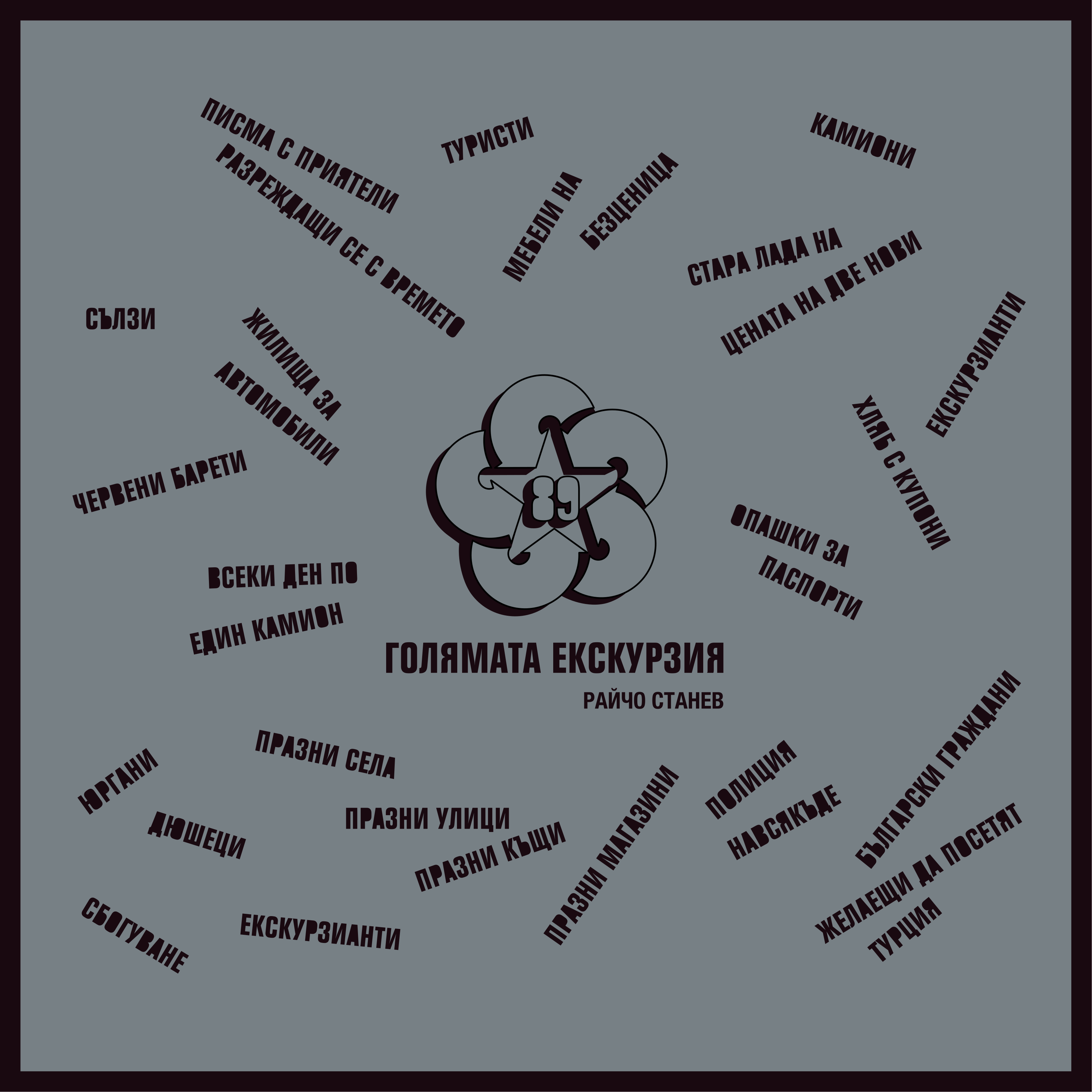
In The Great Excursion, using only words and well-chosen typography, I analyze the 1989 migration of more than half a million ethnic Turks from Bulgaria to Turkey and Western Europe. A topic close to me due to the mixed region in which I grew up and my childhood friendship with many ethnic Turks. The expression of such a delicate topic can be most easily done through personal memories of a pure childhood, in which something as unnatural and incomprehensible as this political emigration took place. I had never paid attention to phototype fonts before - I used such a phototype layout, in a simple and clear way I wrote in words on several walls a few childhood memories of this process. The question of the type of Cyrillic script did not arise before me at all - the project was so imbued with my own identity that the Cyrillic script in it could not be any other than Bulgarian, including its Latin layout, which I used for the translation into English. So, besides Sofia, The Great Excursion was presented in London, Berlin, Birmingham, Zurich and of course Istanbul. The presentation of the project in London also connected me with my friend David Pearson - Type as Image, which really changed my understanding of typography in general. So let's talk a little about the restoration of letters, with a message that brings out a collective dream of a Bright Future.
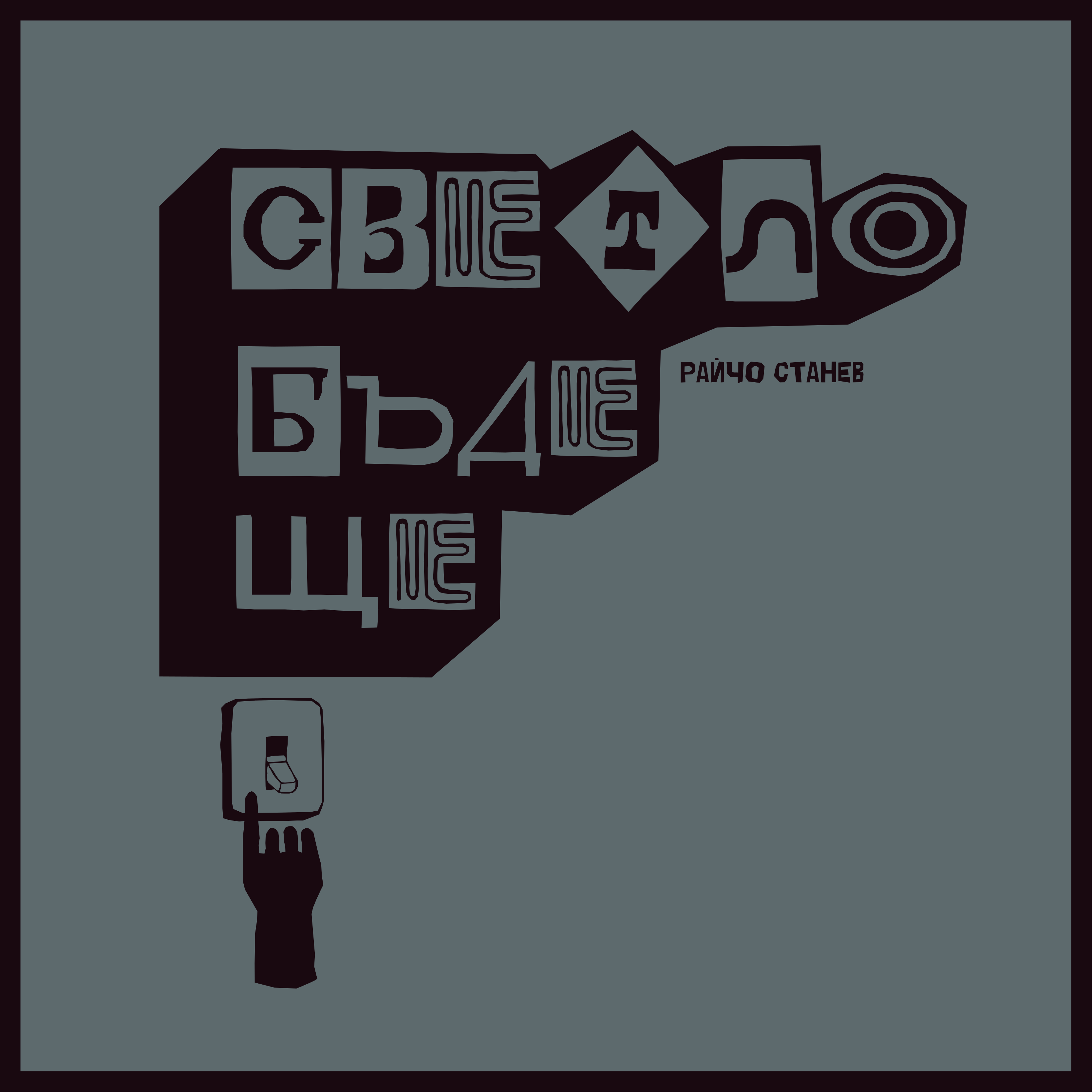
A message built with the help of restored glowing letters, forgotten somewhere on the old facades of buildings on our city streets. A message that managed to pass the test of time and capable of uniting and directing those who see it in the right direction beyond the gray everyday life and covering many of the questions of causality in our time. However, building a font composed of old neon letters turned out to be a very practical activity - I began to perceive the letter three-dimensionally, even if it remained in the two-dimensional space of the sheet in front of me. Since all the letters from the old neon advertisements were handmade, they bore the handwriting of each local craftsman who made them. So, in addition to three-dimensionally, I began to perceive them as manuscripts and to better understand their codicology. Important foundations on which the architecture of a letter is built, i.e. Not just a series of rules that we follow because we have been taught to do so since childhood. This is a whole new world, driven solely by the tireless desire to deal with it. As we well know, with a hand-written/made letter, every imperfection is a quality of the letter.
☜
© raycho stanev, all rights reserved